Redesigning a tool people worked around
2026 · Arcto · B2B Analytics Platform

Introduction
Arcto helps operations teams at mid-sized logistics companies track fleet performance. The product had years of useful data inside it. Nobody could read it. I worked with their team for six weeks as a freelance product designer, focusing entirely on the main dashboard.

The Problem
The dashboard had been built incrementally over two years, responding to individual feature requests. It ended up with 34 metrics displayed at once, no hierarchy, and no way to tell what needed attention.
Operations managers were screenshotting parts of it and pasting into spreadsheets to do their actual work. The tool had become a data source for a workaround.

Solution
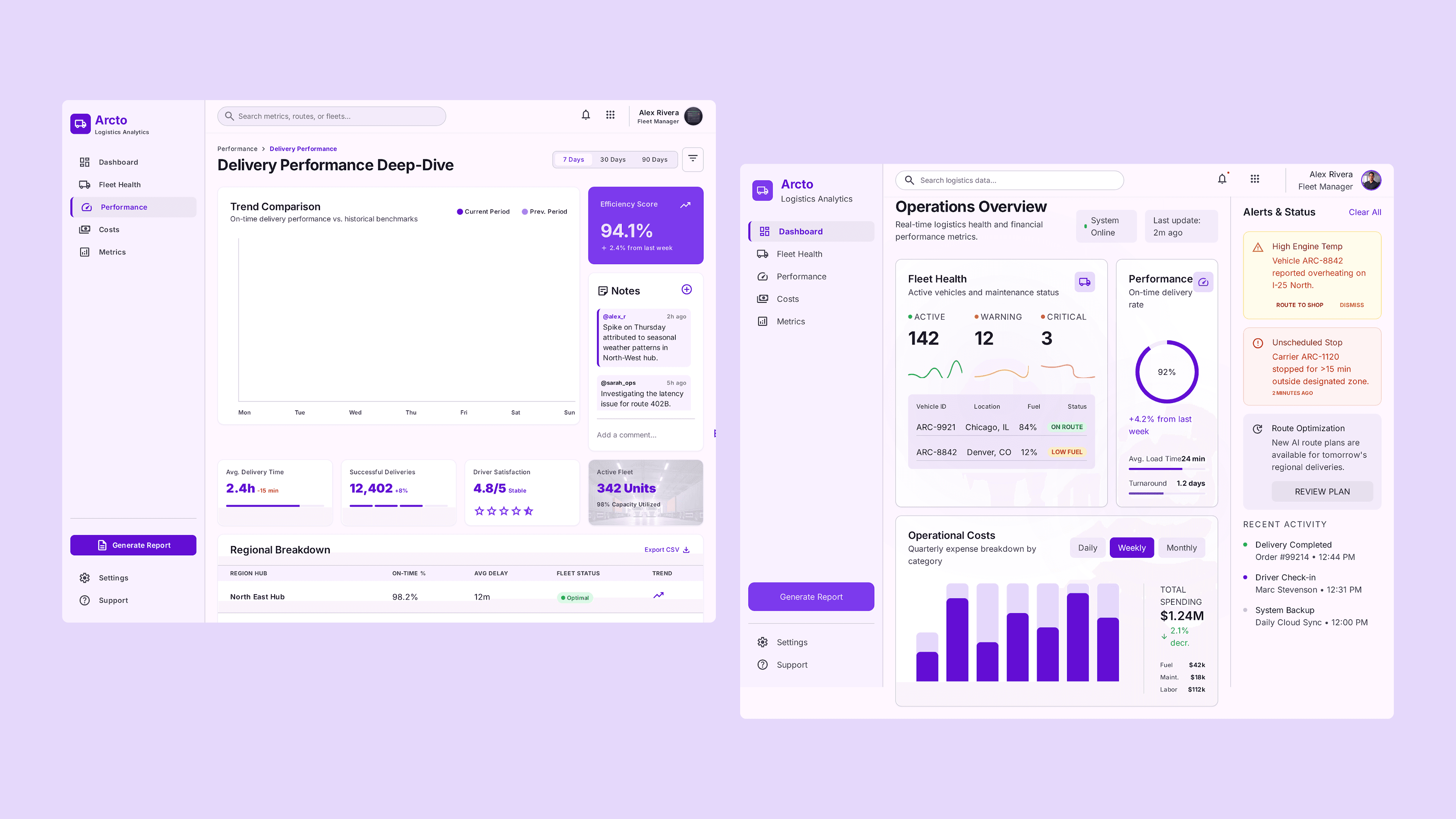
I reduced the dashboard to twelve metrics, organized into three groups: fleet health, delivery performance, and cost. Everything else moved to a drill-down view one click away.
Status indicators replaced raw numbers so managers could see at a glance what needed action.
Charts got plain-language summaries alongside them: "3 vehicles overdue for service" rather than a standalone figure.
A configurable alert rail let each team surface what mattered most to their operation.
Results
Daily active usage went from 23% of licensed seats to 61% in five weeks. Support tickets about missing information dropped 44%. Three enterprise accounts flagged as churn risks renewed within the quarter, citing the redesign in their feedback calls.
